Have you ever thought about creating a brand within your brand? If you’ve ever created digital products, courses, or workshops and wanted to create a mini brand of its own that still aligned with your main brand, this blog post was meant for you. Today, we’re covering one of the easiest ways to develop a mini brand within a brand.
Establish your main brand colors
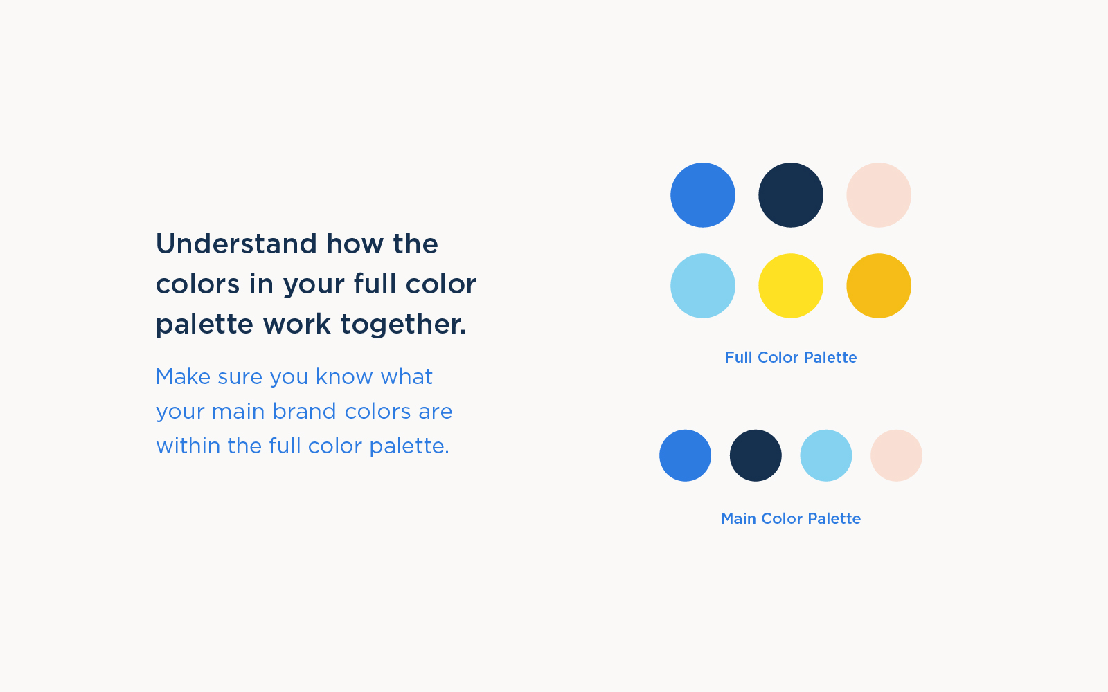
If you’re trying to develop a mini brand within your main brand, one of the simplest ways to accomplish this is by creating secondary color palettes. In order to do this, you should have a full color palette established for your brand. Out of that full color palette, you should assign one or two colors as your main brand colors and a total of three or four colors that would serve as your main brand’s color palette. For consistency, you should stick to those colors as much as possible.

Building a Second Color Palette
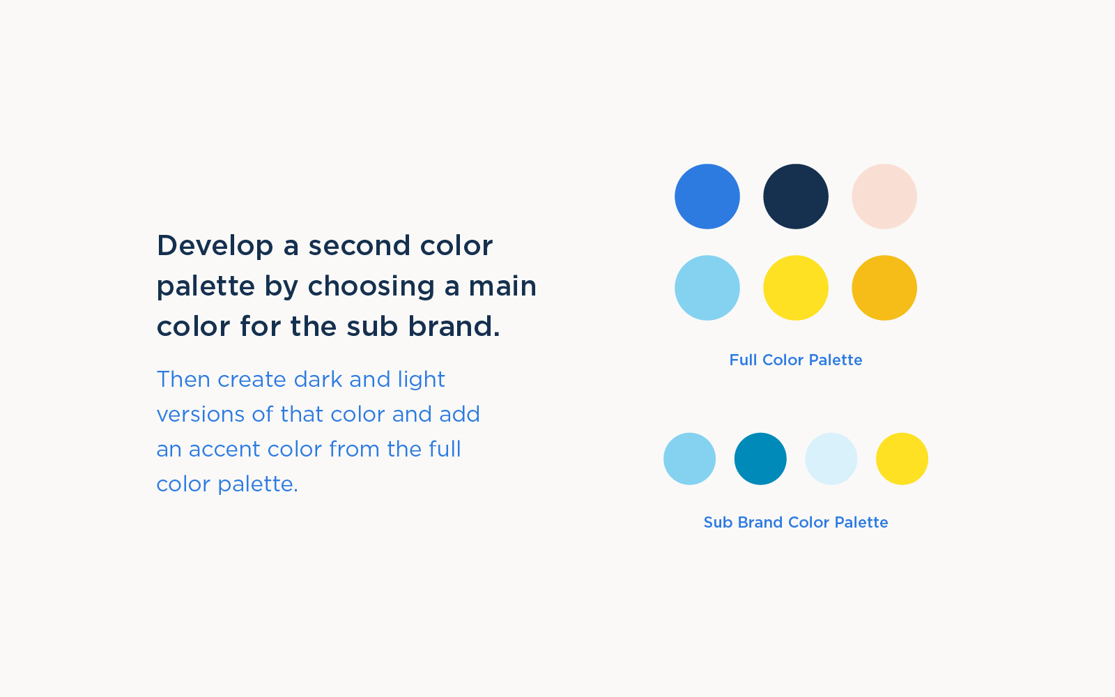
To develop a secondary color palette, choose a color from the full color palette that doesn’t serve as the main color of your brand. For example, for Sung & Co, the main brand color is blue. For a secondary color palette, we’ll want to use a color that’s not blue. For this example, let’s choose cyan as the main color for the secondary color palette (or mini brand).
Make sure colors have contrast
All great color palettes have dark, mediums, and lights so your visuals have good contrast overall which helps every piece of content you create have great contrast. For this particular shade of cyan, it’s more of a medium, so we’ll create light and dark versions of this cyan and add those to the color palette.

Pick an accent color
Next, we’ll pick an accent color. The accent color should also belong in your full color palette and complement the main color of the secondary color palette. In this example with the color cyan, we’ll use yellow because it’s a great complementary color.
Building a third color palette
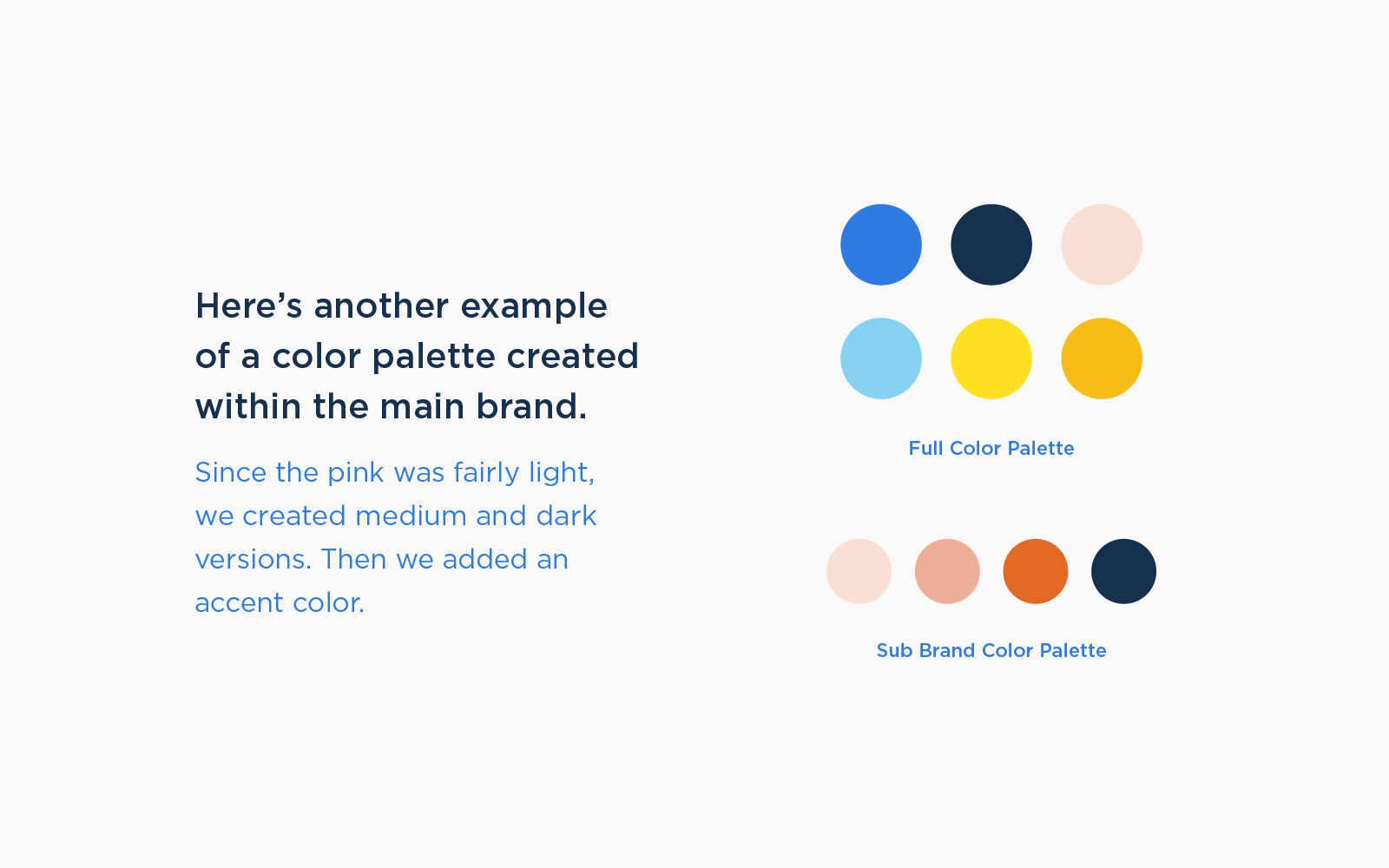
To create another color palette within the same brand, let’s choose another color from the full color palette that doesn’t serve as the main color for either the main brand or the secondary brand we just chose. In this example, we’ll choose pink from the full color palette.

Because this particular shade of pink is fairly light, we’ll need to create medium and dark versions of this color to make sure we have great contrast in the color palette. Next, we’ll choose a complementary color that goes great with this pink. In this case, we’ll choose the navy. It looks great with pink and has great contrast.
Creating color palettes for mini brands within your brand is like dressing up triplets. You can have them dress up in the same outfits, but if you have them wear outfits in different colors, you’ll be able to help people tell them apart while still looking like they belong together.
If you’re not already following us on Instagram, be sure to follow us! We love simplifying the branding process so it’s fun and less intimidating!
Until next time,
Happy Branding!

