
Did you know that colors evoke certain emotions and help people form an impression about your brand? Just think of all the potential customers who haven’t quite gotten to know your business yet, but they’ve already started forming opinions based on what they see…
So questions you should ask yourself when it comes to choosing your brand colors are:
What do you want your brand to say to your audience?
Do you want your brand to be known as a bold, aggressive brand that attracts highly driven action takers?
Or do you want your brand to feel soothing and refreshing because your brand provides natural, sustainable products?
While some business owners might take on a more personal approach by just choosing their brand colors based on what they feel or what their favorite colors are, we want you to take it up to another level by strategically selecting your brand colors that reflect what you do, who you want to attract, what your core values are, and what you want your brand to be known for.
When it comes to making decisions about your brand, we want you to be intentional about every little thing. It’s there in all the little details where great brands are born and recognized.
So how do you pick the best colors for your brand?
When it comes to picking your brand colors, there’s actually a lot of psychology behind the process.
There have been so many great studies done on color psychology, but here’s the abbreviation version of their associated moods if you don’t want to go through thousands and thousands of data:
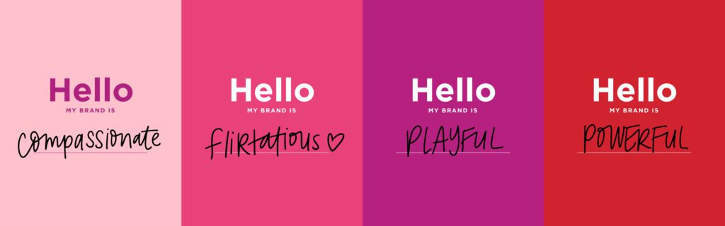
Pink: The moods associated with the color pink are compassionate, affectionate, romantic, innocent, gentle, and sweet. On the flip side, the moods negatively associated with the color pink are too sweet or sentimental and fragile.
Red: The moods associated with the color red are dramatic, energetic, magnetic, energizing, assertive, adventurous, and powerful. On the flip side, the moods negatively associated with the color red are dangerous, violent, and overly aggressive.
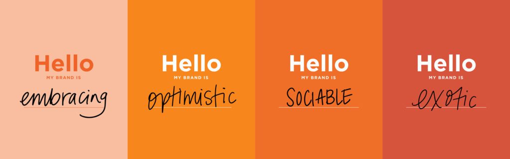
Orange: The moods associated with the color orange are whimsical, friendly, optimistic, spontaneous, and sociable. On the flip side, the moods negatively associated with the color orange are loud, prideful, and arrogant.
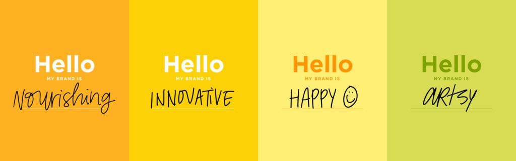
Yellow: The moods associated with the color yellow are enlightening, hospitable, nourishing, warm, sweet, and cheerful. On the flip side, the moods negatively associated with the color yellow are impatience, fear, and jealousy.
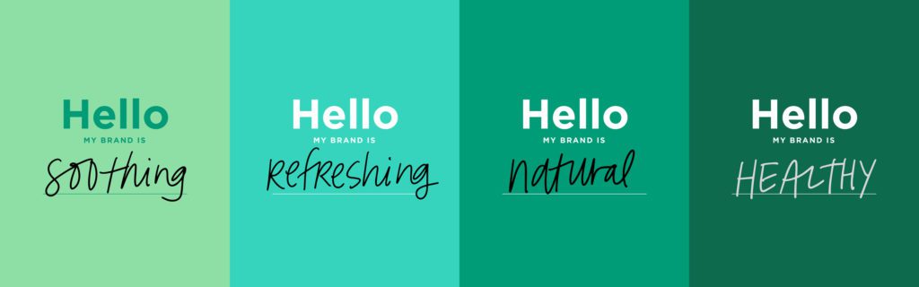
Green: The moods associated with the color green are fresh, spring, renewal, harmony, healthy, restorative, and environmental awareness. On the flip side, the moods negatively associated with the color green are greed, judgemental, and materialistic.

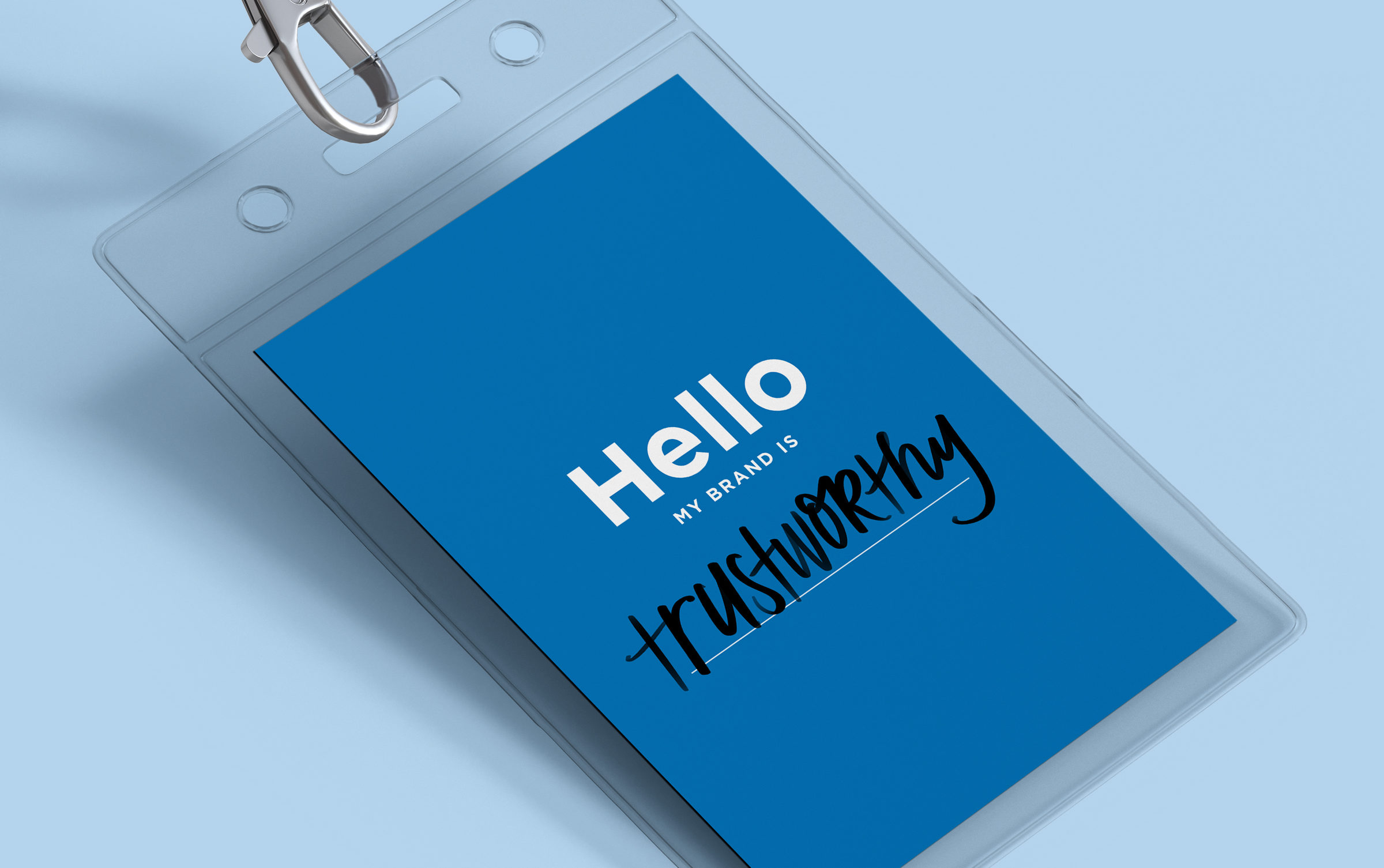
Blue: The moods associated with the color blue are trustworthy, responsible, impressive, reassuring, calm, and high-spirited. On the flip side, the moods negatively associated with the color blue are depressive, predictable, and conservative.
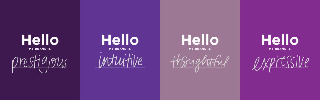
Purple: The moods associated with the color purple are meditative, mysterious, creative, spiritual, introspective, and intuitive. On the flip side, the moods negatively associated with the color purple are sensitive, emotional, and immature.
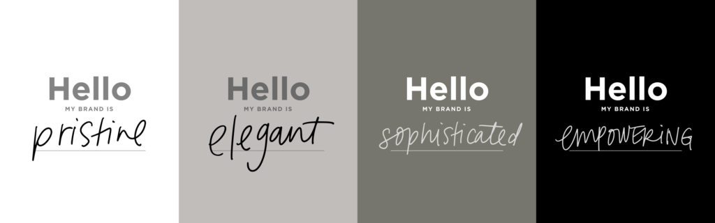
White: The moods associated with the color white are pure, simple, modern, innocent, spotless, lightweight, and clear. On the flip side, the moods negatively associated with the color white are clinical, unfriendly, and empty.
Black: The moods associated with the color black are bold, classic, sophisticated, expensive, magical, and mysterious. On the flip side, the moods negatively associated with the color black are depression, pessimism, and evil.
Now, I know that the colors listed above are touching on the generalities of each basic color. And if you’re familiar with a box of crayons these days, you know there are more than those 9-10 colors.
The best way for me to explain the in-betweens (yep, that’s my technical term for them). If your brand color is a little mix of 2 or 3 colors, then the moods associated with those colors tend to overlap. I’ll give you an example…
Let’s say your main brand color is a peach color. The color peach is a little bit of pink, orange, and white. So the moods associated with that peach color might be creative, sweet, and airy. The shades and combinations of colors will skew the moods associated with it a bit. And that’s ok. Utilizing psychology when we choose our colors is not to put ourselves in a box, but how we can best way to communicate to our customers who we are and what we believe.
Without the influence of other brand elements, text, or imagery, your brand color can say a lot in itself.
Just imagine if your brand color wore a nametag…what would it say?
To get more helpful tips straight to your inbox, subscribe to our newsletter!
Until next time,
Happy Branding!
