If you’re reading this blog post, you might be wondering how to create your own logo design. Or maybe you’re curious about the logo design process because you’re ready to invest in a professional logo that will serve your business long-term. Or maybe your logo has served you well in the past several years, but now it’s time for a rebrand.
No matter why you’re here, we’re sharing our logo design process with you so you’ll gain a little more appreciation for the process and how a great logo can add so much value to your business.
I know many logo designers start by grabbing inspiration, pull from top competitors, find out what’s currently trending, or finding really cool looking fonts. While that’s not necessarily wrong to do, we start the logo design process by what we feel is the most essential.
How do we start the logo design process?
We start by asking very important questions about your business to make sure your logo isn’t just a pretty mark, but a mark that strengthens your business.
To start, we get to know the business basics:
- the name of the business
- what industry that business is in
- if there are any taglines
- services or products are being offered
- the story behind the name
To create a logo with more depth, we dive into the heart of the business by getting to learn more about the vision and purpose behind the business, the person behind the brand, how it’s unique to competitors, and the message the brand wants to share with its target audience.
We usually work through the brand strategy with our clients, however, if someone has already developed their strategy elsewhere and they just need support with their logo design or their brand identity, here are a few questions to start with:
What are your core values?
Have you seen those viral videos going around that say something like, “Tell me you’re organized without telling me you’re organized.” We want to do that with your logo. If we could express your core values in a visual way, what could that look like? This helps generate ideas that lean towards a conceptual logo rather than a literal logo.
For example, if you owned a shoe company, you don’t necessarily need a shoe to serve as the logo…especially if that brand had ideas of expanding into different types of products in the near future.
Who are the people you want to work with? Who are your ideal clients?
We really try and step into your ideal client’s shoes. What brands do they love and why? What are they attracted to? How do they decorate their homes? How do they dress? In what ways could your logo grab their attention?
How do you want your target audience to feel when they interact with your brand?
Whether we realize it or not, we’re all visual people. And because of that, we want to establish a great first impression. So when we think through what your logo could look like, we should think about how we want your target audience to feel. If you want to establish yourself as a luxury brand, you’ll want to make sure you choose the right fonts and colors to create a luxury feel. If you want your brand to feel feminine, you’ll want to choose support assets that help give a feminine feel.
What is the message you want to communicate to your target audience?
There are different ways you can share your message, but what’s the one unique message you want your target audience to understand? What do you want your audience to think, know, and do after interacting with your brand? So our job when creating a logo is to design a logo that aligns with that message.
How are you positioned to stand out from your competitors?
This is all part of the brand strategy process…and an important one. If you don’t know how you’ll be different from your competitors, how will the rest of your brand be different? We like to incorporate what makes your brand truly yours by taking every aspect of your business and creating a mark that tells your story.
The Logo Creation Process
After the strategy portion of the logo design process is done, we get to start the creative process! This is probably our favorite part of the process because we don’t edit any ideas! We sketch out all the ideas, simple, basic, quirky, crazy…all of it. We don’t say no to bad ideas here because we know that it could potentially lead to something really creative! I couldn’t tell you the exact number of sketches, but they creep towards hundreds. They’re quick, very rough sketches…just enough to put an idea down on paper. We never show this part of the process to the client, but it’s our way of brain dumping everything onto paper.
Next, we take a few strong concepts (sometimes combing a couple of them together) and start designing the logo on the computer. You can have a great idea, but the execution needs to be there too. We spend some time refining a few logo options to the point where they’re presentable. We always start in black and white to make sure the logo has great contrast!
To us, it’s not just about picking a couple of fonts and typesetting a mark. We want to create a mark that’s unique to you so that no one can replicate your logo by typing words with a cool font.
When we’re creating logomarks and logotypes, we take into consideration each letter form, the layout of the text, and what we can do to make it even more aligned with your brand.
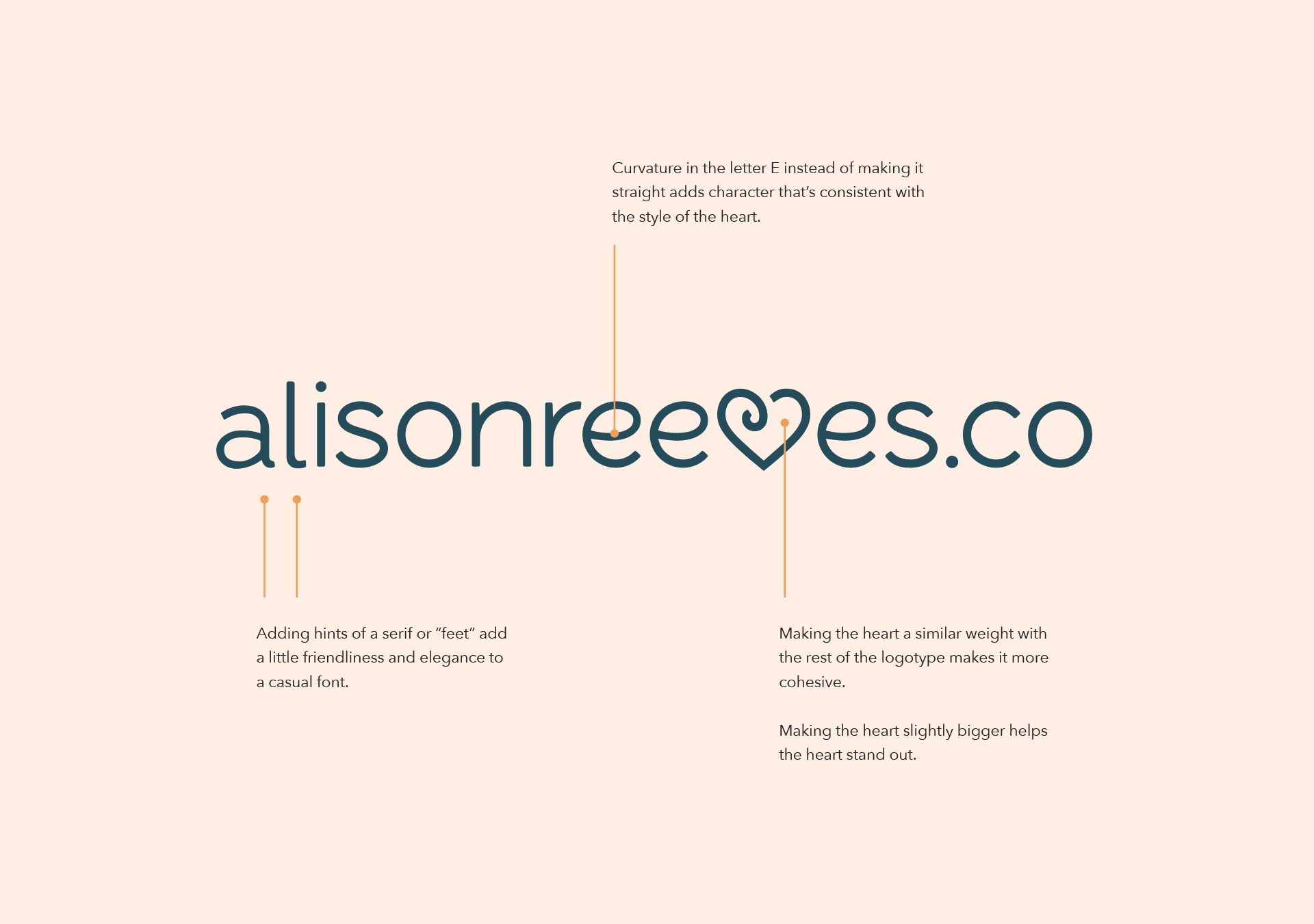
Here is an example of a logo we updated for Alison Reeves:
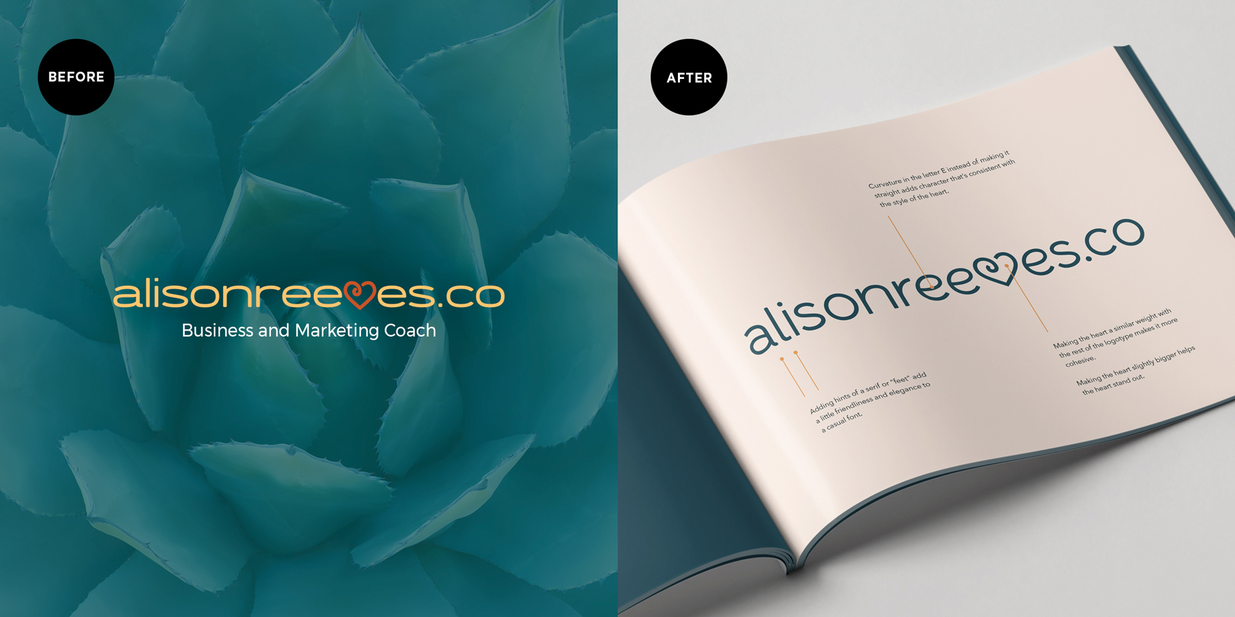
The original logo had great bones, but we made small edits to make an even bigger impact on her brand. Here are some updates we made:
- We make the font taller to create more openness and add a little more femininity to the logo.
- We added hints of a serif or “feet” to add a little friendliness and elegance to a casual font.
- We created a slight curvature in the letter E instead of leaving it straight to add character that’s consistent with the style of the heart.
- We also decided to make the heart slightly bigger to help it stand out just a little more.
- We made the heart a similar weight with the rest of the logotype making it more cohesive.
After approval of the primary logo, we create variations so that you have other versions to use for different purposes and platforms. Other than the primary logo, we include a secondary mark (this can mean a horizontal version of the logo), and a favicon. The number of variations will vary depending on how the marks will be used across each platform and channel — this is determined in our strategy work together in the logo design process.
Would your logo pass the test?
Now that we’ve walked through the short version of the logo design process, are you curious to know what your logo should look like? Check out this post and download our free resource that guides you through the elements of a great logo and see if yours would pass the test!
If you’re ready to work with us, book a call! We’d be honored to create a custom mark that aligns with your vision and purpose!
Until next time,
Happy Branding!
