
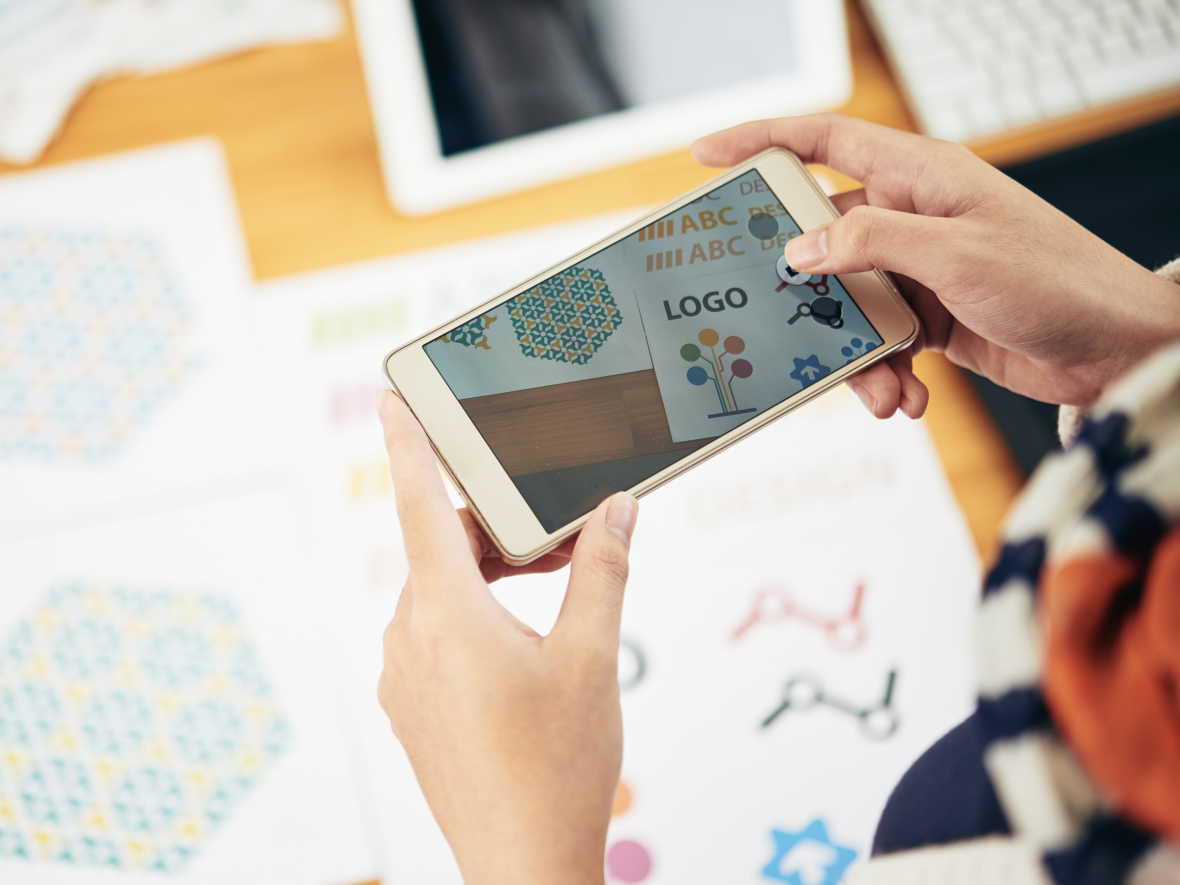
Ever wonder what the logo for your business should look like or even what makes a great logo? Curious if your logo would pass a design test? Before designing a logo, we should understand WHY we should create a logo in the first place. Not just any kind of logo, but a compelling one! A logo that people will remember when they think about your business.
Your logo is not the end all be all, but it does leave an impression with people, and we always want to put our best foot forward, don’t we?
Studies show that 90% of people judge a business by its looks! And we don’t want to lose any potential clients because you don’t have a great logo established. Do you want your business to have a professional edge? Or a business that’s mistaken for a side hustle? The harsh truth is that your brand is how others perceive your business.
What makes a great logo?
A great logo:
- Is simple
- Is timeless
- Is memorable
- Represents your brand’s message
- Attracts your ideal customers
- Is scalable
- Is legible
- Is unique
When we think about our business, we want people to know what our business represents, understand the value we give, appreciate the quality of service we deliver, and we want them to remember our brand over the competitor.
We want your business to have a well-designed logo…
A logo that stands out...
A logo that can live for years to come...
A logo that attracts your ideal customers.
Let’s say you’re shaking hands with a potential employee. The handshake is firm so your first impression might be that this person is confident.
If you’re using a dating app, you may swipe left (or right) based on what you see and what image they use on their profile.
And just like that, your logo leaves a first impression on your potential customers and a good first impression is a part of what makes a great logo.
Built to Last
A great logo is a valuable asset to your business because it represents your brand. When a client has a great experience with your brand, they’ll remember that experience when they see your logo.
The human brain was built for visual information. In fact, 90% of the information processed by the brain is visual. So designing a memorable logo is super important for our potential customers to remember us the next time they need our services.
There are a lot of factors to consider when designing a strong logo that’s built to last. Here are a few questions to think through when creating a logo that will represent your brand really well.
What product or service do you offer?
What are some of your core values?
What type of customers do you want to attract?
How do you want potential clients to see your brand?
Who is the competition?
What is your brand’s personality?
Color Selection
Some small business owners choose colors based on their personal preference or color palettes that are super trendy right now. But we encourage you to choose your colors based on your brand goals, target audience, brand message, and brand personality.
Colors can mean so many different things! They can evoke an emotion, a specific mood, and even help tell a story. How you combine colors can also play a huge factor on how your brand feels and how it's perceived.
The best way to choose your colors is to keep your goals and your ideal customers in mind. You’ll hear us say this over and over again — it’s just too important!
Here are a few characteristics and descriptions for each color:
Pink: Intuitive, Empathy, Sensitivity, Romantic
Red: Passion, Strength, Energy, Courage
Orange: Optimism, Energy, Balance, Warmth
Yellow: Creativity, Happiness, Confidence, Uplifting
Green: Harmony, Growth, Renewal, Peace
Blue: Tranquility, Intelligence, Trust, Reflection
Purple: Spirituality, Imaginative, Mystery, Compassion
Brown: Earth, Reliability, Conservative, Support
Black: Mysterious, Power, Authority, Elegance
White: Purity, Wholeness, Simplicity, Clarity
Grey: Neutral, Moody, Serious, Mature
Font Selection
For logos, specifically, we love to take a couple of different foundational fonts and build a custom logotype for businesses. This is part of what makes a great logo because this way, your business will have a truly custom logo.
By customizing your logotype, you can add subtle changes to the text to help create your brand’s personality!
So where do you start when picking out the best fonts for your brand...
There are a few different categories a font will go into, but we’ll talk about two main categories.
Serifs vs Sans Serifs: What’s the difference?
Serif fonts have little “feet” in its letters that form lines or tapers at the end. Sans Serif fonts — sans means “without” — are letters built without these “feet.”
If your brand is a little more traditional and elegant, choosing a Serif font to represent your business would be a great decision. Sans Serif fonts are more modern, clean, and minimalistic.
You also want to keep in mind that when you choose a font, make sure it’s easy to read, represents your brand personality, and attracts your ideal customers.
Pro Tip: Try and stay away from fonts that are super trendy (like some overly cursive fonts) as they’ll get outdated fast and can be super hard to read especially when scaled to a smaller size.
Scalability
Does your logo have great contrast? If your logo was printed in black and white, would you be able to see what your logo is? Would you be able to read what your logo says?
Here’s a tip, when you start designing your logo, create your logo in black and white first! If your logo looks good in black and white, you can guarantee that it will have great contrast when you introduce colors into your logo. Just make sure you pick the right colors to keep the contrast!
We’ve seen logos designed with really thin lines and very pale colors because it was super trendy at one point. It started off looking okay at a large scale, but when scaled to a smaller size, it was extremely difficult to read. Unless it’s a watermark, your logo should be super easy to see and read. You want your logo to stand out!
After you add colors to your logo, start playing around with the size. Blow it up to a large size to make sure everything is lining up as it should. When you scale it down to a small size (just under an inch), can you still read what your logo says or what it is? If not, go back and edit your logo to make sure that it does.
Less is more! Don’t be tempted to throw in a lot of information into your logo. Simple is best when it comes to creating a logo that lasts! If you do include more information, be sure to create a responsive logo. Responsive logos are alternates that look similar to your main logo, but leaves out some information as the logo is sized down.
If you insist on using a cursive font to add a little more personality into your logo, be sure to triple-check the legibility of your logo. If it’s really hard to read, scaling it down to a smaller size will make it that much more difficult. Some logos that use overly cursive fonts makes it almost impossible for a potential customer to read your logo.
Make sure your logo is easy to read at any scale!
Pro Tip: Make sure you have vector files for your logos. Vector files will ensure that your logo always stays nice and crispy when scaling — which means it’ll never lose its resolution!
Create A Compelling Logo
Now you know what your logo should look like. You want to create a logo that attracts your ideal customers, conveys your brand message, and a logo that helps position your business to look professional!
The goal here is not to make a logo that’s “good enough” or one that looks like everyone else out there. The goal is for your business to have a logo that represents your unique vision and what your business will become in the future.
A great logo is a really powerful thing and can say a lot to your ideal customers.
To recap all the things we mentioned above, a great logo is immediately recognizable.
A great logo reflects your brand’s message and helps you stand out from your competitors.
An effective logo looks professional and seamlessly fits in with a brand’s identity.
And a great logo also needs to work at any size and anywhere you want to use your logo.
A great logo:
- Is simple
- Is timeless
- Is memorable
- Represents your brand’s message
- Attracts your ideal customers
- Is scalable
- Is legible
- Is unique
Keep in mind these key ingredients when building a compelling logo. Even though your logo is just one small part of your brand, it’s one of the first things people see.
What type of first impression will you want to make on your target audience?
Will your logo help them know what your business stands for?
Will it tell them that you take your business seriously?
Will it show them your brand’s personality?
Will it inspire YOU to grow your business to its fullest potential?
Grab our free resource, Would Your Logo Pass the Test, to have as a reference as you’re designing your next logo!
Until next time,
Happy Branding!
