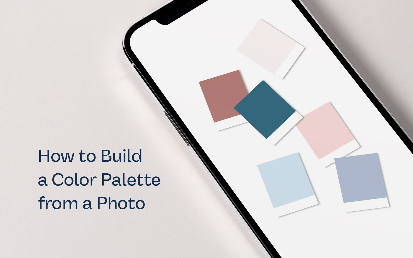
You might be amazing at what you do, but when it comes to picking out colors for a specific project or brand, some people feel stuck…and that might be you. So in this blog post, we’ll be walking you through how to build a color palette using a photo as inspiration.
Use a Photo that Best Represents Your Project
Whether you’re creating a color palette for a project or developing a brand, grab a photo or multiple photos that best represent the direction.
Our favorite go-to websites for high-quality photos for inspiration are Unsplash and Adobe Stock. For this particular example, we’re going to pull a few photos from Unsplash.
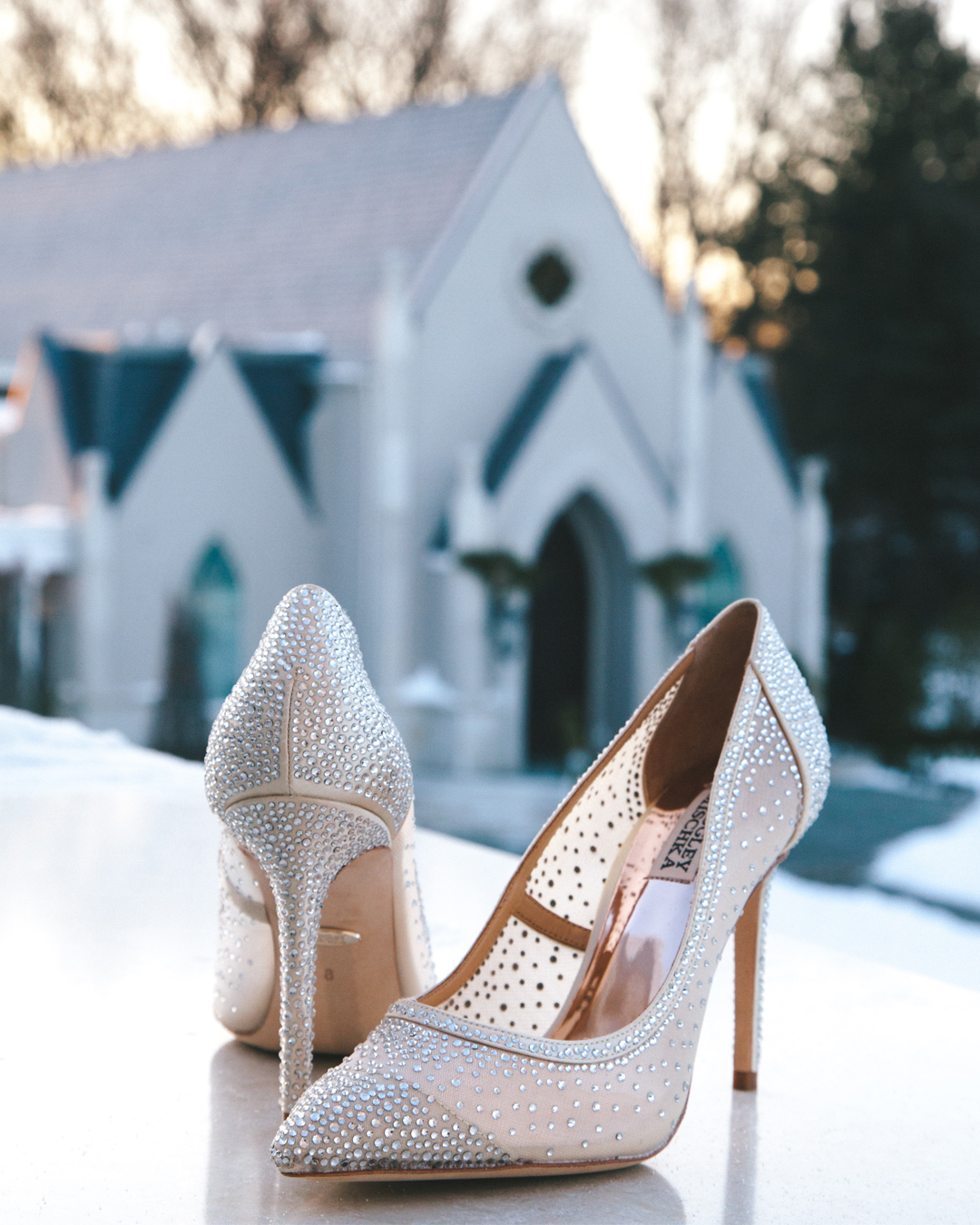
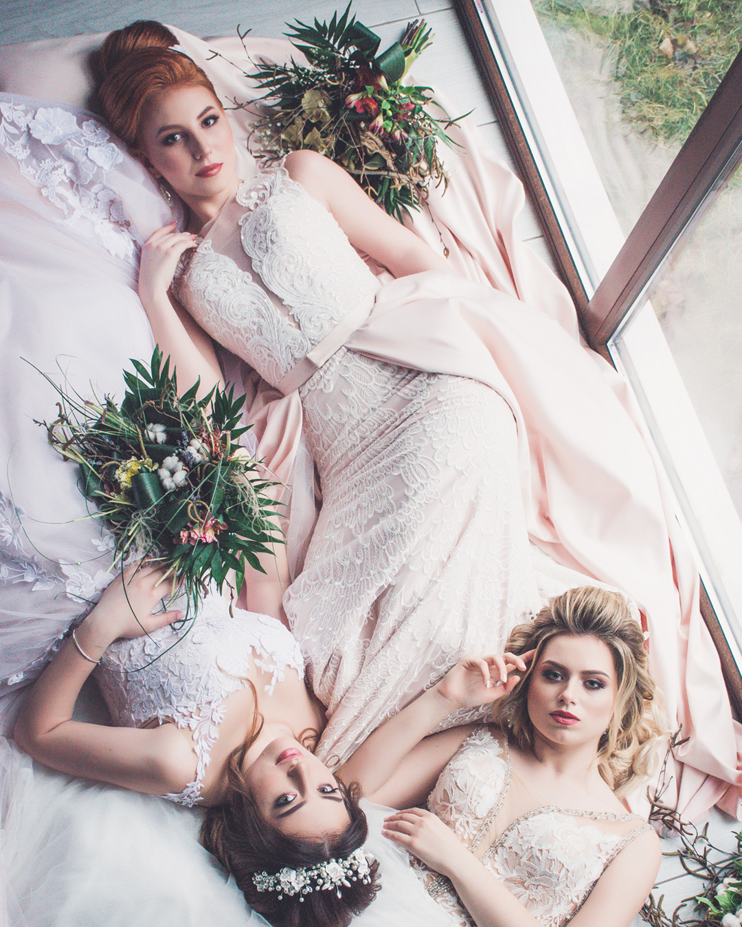
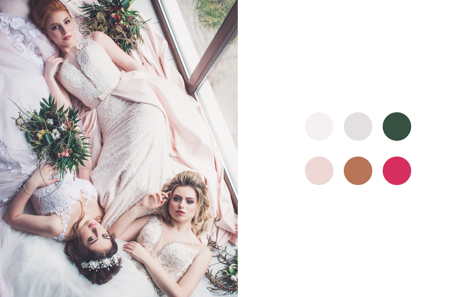
When picking out your photos, remember what you want to say about your brand. In this example, we want to build a color palette for a luxury wedding so we pulled a couple of photos that we feel inspired by and images that best represent the overall direction.
Use the Eye Dropper Tool to Capture Colors
Whether you’re using Canva or Photoshop, you can select colors from a photo using the Eye Dropper Tool.
In this first photo with the heels, we love the rose gold color that pops out from the shoe. We’ll grab the color from the heel and set it aside. Notice there are darker and lighter shades of that rose gold color so we’ll go ahead and capture both for contrast.
Next, we love the greys that we see in the background of the same photo so we’ll use the Eye Dropper Tool and grab the light, medium, and dark colors shown in the image.
Then we’ll go to the other photo and do the same, picking out light, medium, and dark colors.
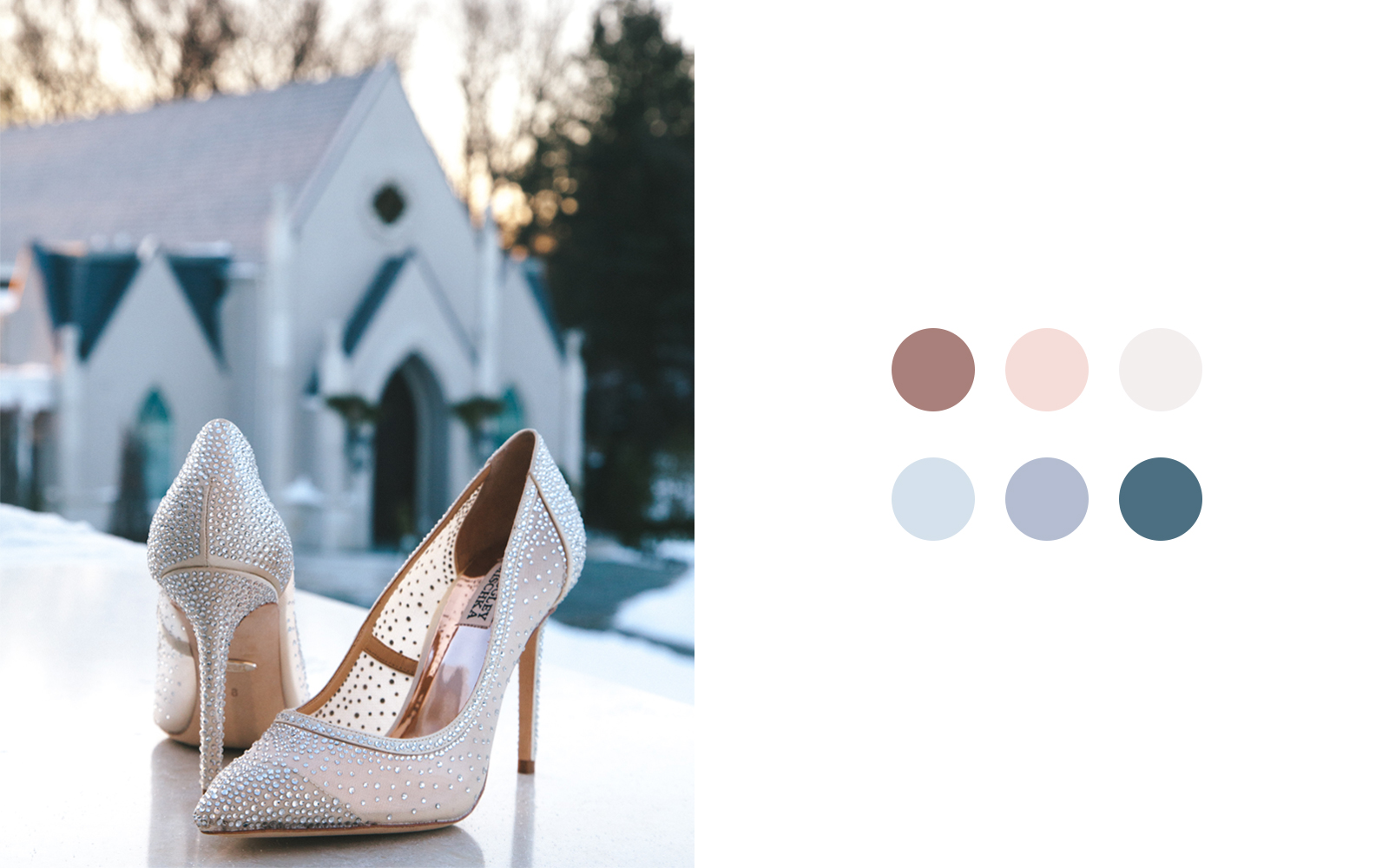
When you’re done, you might notice that there might be similar colors that overlap. To avoid having too many colors in your color palette, we’ll go ahead and eliminate similar colors and narrow our palette so that it has no more than 8 colors.
Remember, these photos are just for inspiration so you can tweak the colors a bit to make sure it aligns with the direction you want to go in.
Be Sure to Have Great Contrast in Your Color Palette
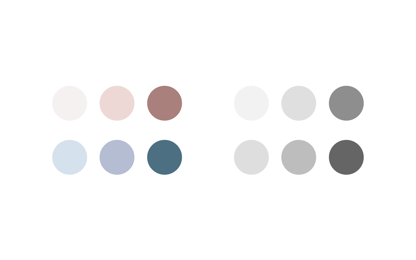
After capturing colors from the images and narrowing them down to no more than 8 colors, you want to make sure you have great contrast in your color palette. A great way to do that is to turn the color palette into greyscale and see if there are lights, medium, and darks. We suggest using Photoshop for this because, with just one selection, you can turn the file into greyscale. If you don’t have the ability to check the contrast this way, make sure you have darks and lights in your color palette and you should be good to go.
Get Creative When Naming Your Color Palette
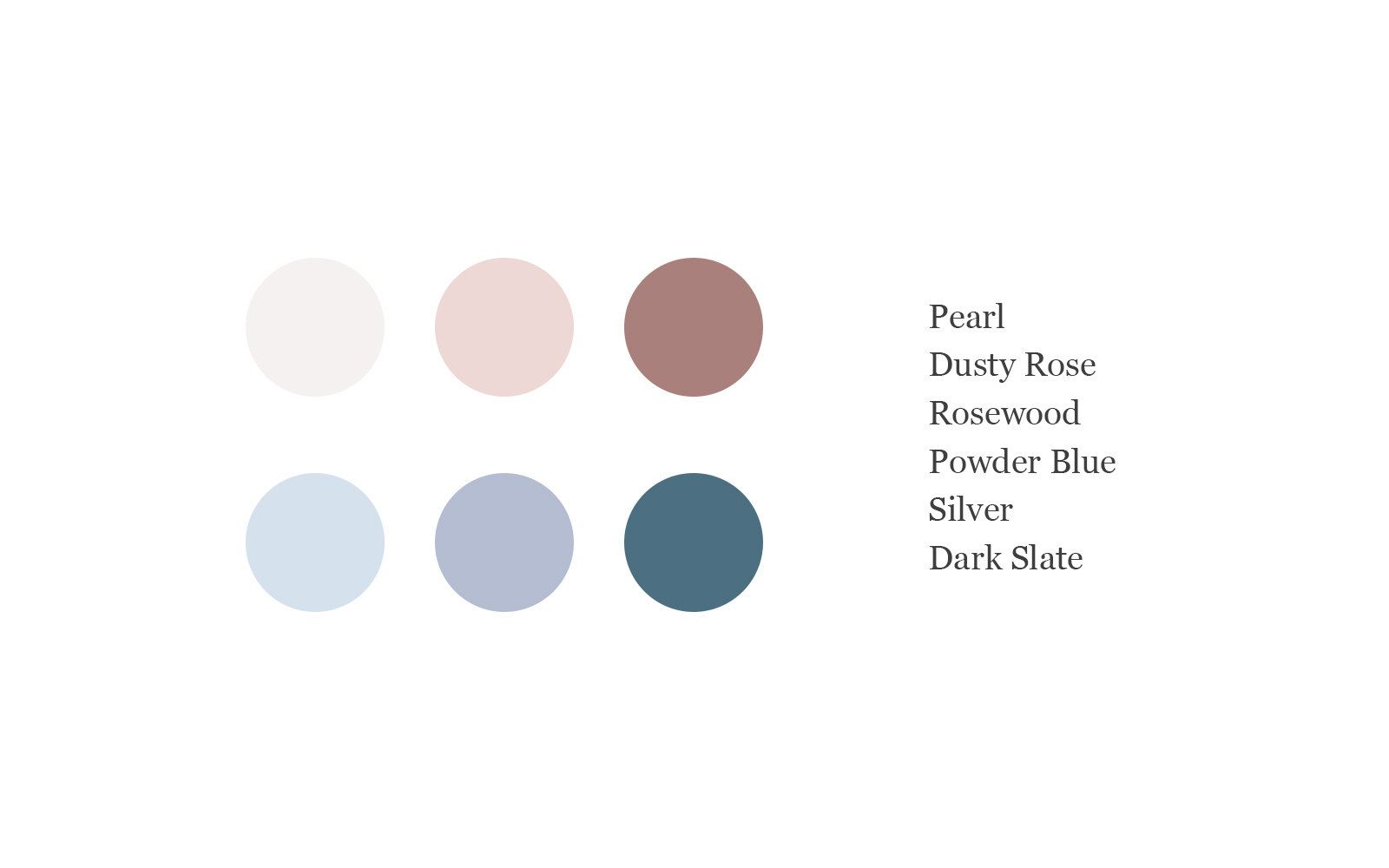
Naming your colors in a creative way isn’t something you have to do, but it’s definitely nice to have all of the little details help tell your story. Instead of naming one of the colors “Off White”, you could name it “Pearl” because it still describes the color but it feels elegant. We’re going for a luxury wedding so the color “Off White” doesn’t quite describe what we're trying to accomplish.
Instead of naming a color “Grey”, we might want to call it “Silver” because it does describe a kind of grey but has a luxury nod to the name — which we want to carry throughout our project.
Naming our colors in a creative way just helps us create a better story overall. For this example, we ended up naming our colors: Pearl, Dusty Rose, Rosewood, Powder Blue, Silver, and Dark Slate.
Show Off Your Color Palette
There are several ways to show off your colors and infuse them into the rest of your brand. You can show your color palette on social media, have the wedding party wears colors from the color palette, and design wedding invitations and party favors with the colors from the color palette.
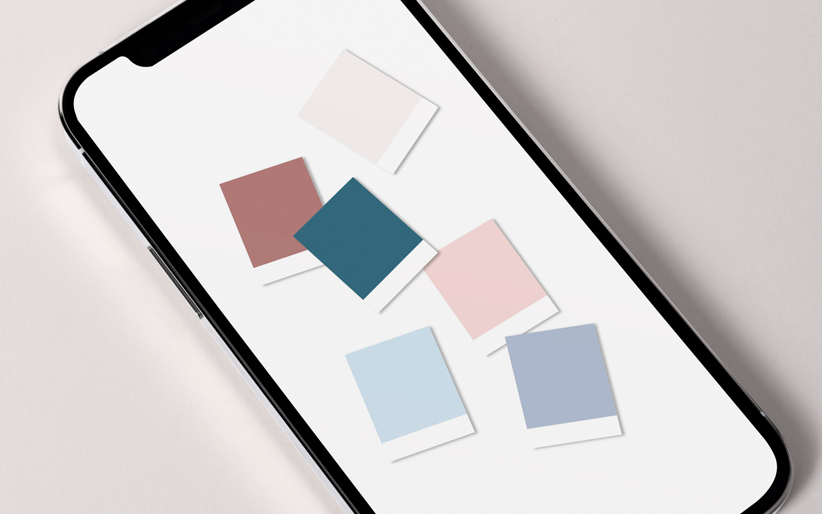
Creating color palettes is so much fun, and we do them constantly for different projects. If you need a color palette template pack to help you show off those colors on social media, be sure to grab our free Color Palette Template Pack.
If you signed up for the newsletter, you can download them from the Resource Library. Be sure to grab the login info from the emails.
Until next time,
Happy Branding!
