As professional graphic designers, we know how to get creative with our fonts and type treatments for the assets we create. From logos, posters, illustrations, and packaging, we know how to use our tools to break apart fonts, combine them, and create something entirely new. But if you’re a solopreneur who struggles to find the time to be a graphic designer, you know, because you have a million other things to worry about in your business, here are a few ways to get creative with fonts and type treatments without using any special effects.
But first…
Cool Fonts to Check Out
Before we dive in, we love finding cool fonts for inspiration! We like to bookmark our favorites to see if we can include them in any upcoming projects. It’s always great to have a list of fonts that makes you drool so you can go back and refer to them when you’re working on a creative project. Like saving those Instagram Posts to reference later, we keep an ongoing list of cool fonts to try out later. Here are a few cool fonts to check out.
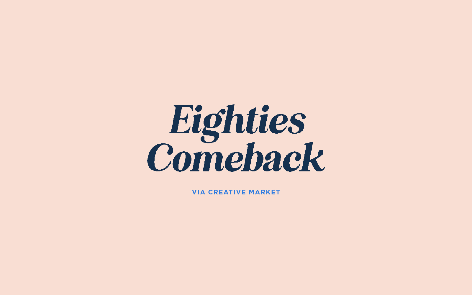
Eighties Comeback
The Eighties Comeback found via Creative Market is one to swoon over. It has an old-school classic feel that can stand against any modern font right now. It’s naturally packed in nicely (meaning you don’t have to worry about the letter spacing on this one) and looks gorgeous in the italic — the curves look so elegant!
Check out Eighties Comeback on Creative Market.
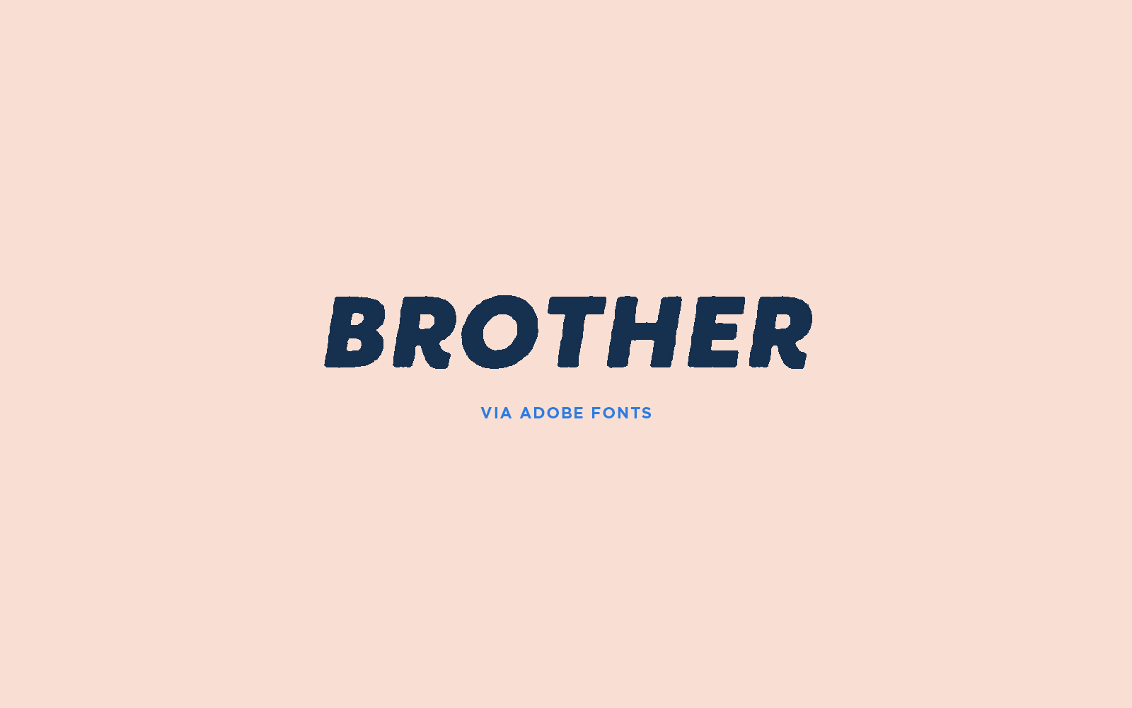
Brother
While Adobe Fonts has a lot of great fonts, sometimes you just have to sift through a ton of fonts to find some ones that have character and are still well refined. This Brother font we came across is awesome! This version of the Brother font is called Brother 1816 Printed Black Italic and if you look closely, it has a little bit of texture around the edges of the letters. This effect will look great on anything that calls for a subtle texture.
Check out Brother 1816 on Adobe Fonts.
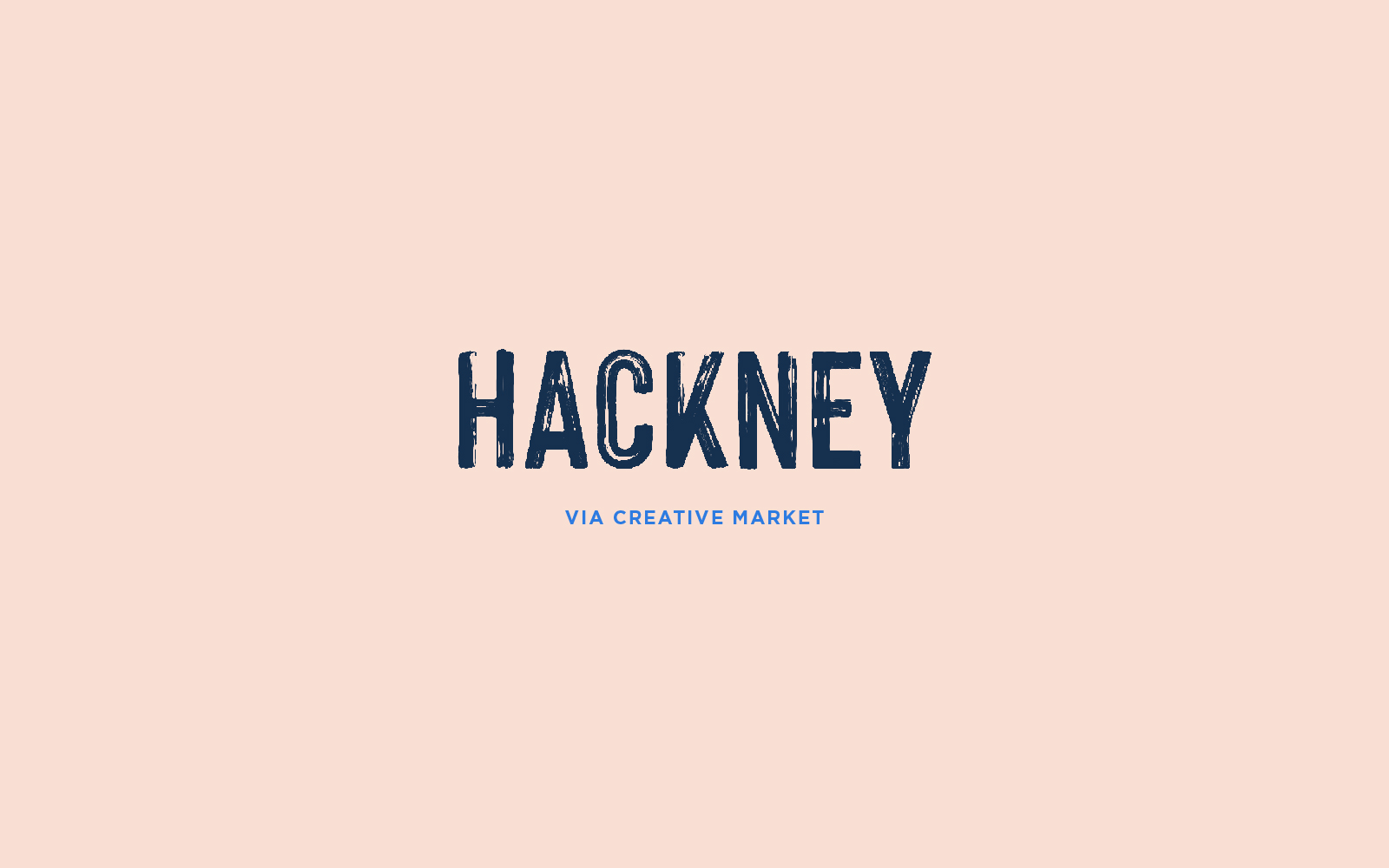
Hackney
This font made us stop in our tracks. It’s really hard to find fonts with a lot of texture like this because it makes the font so complex that it tends to slow down when used. But, this looks worth checking out because it’s beautiful and the brush strokes in each letter look freakin’ amazing. With font programs getting more advanced, there might not be any issues installing and using this font, but again, we’re bookmarking this to purchase later.
Check out Hackney on Creative Market.
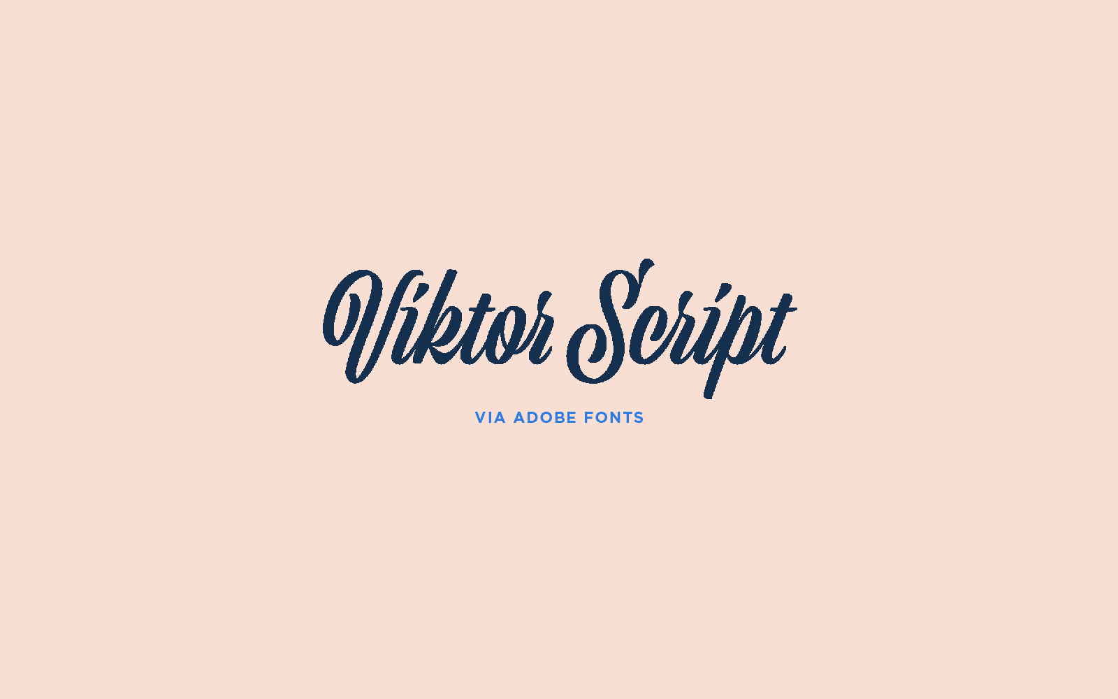
Viktor Script
We found this on Adobe Fonts, and we were blown away. We love this font because it looks like the old-school, hand-painted script signs with a modern twist. The lines are so clean and elegant, and you can almost feel the movement of the “paint” by looking at how the “i” is dotted. A lot of script fonts are really hard to read or not bold enough for what we’re looking for, and this font checks all the boxes. While it’s still a script, it doesn’t have that ultra-feminine feel so you can use this for both male and female audiences. Plus, it feels like a hipster font!
Check out Viktor Script on Adobe Fonts.
Cool Sites to Find Fonts
We get asked a lot by clients, friends, and fellow designers who love collecting inspiration just as much as we do, “Where do you go to find cool fonts?”
While there are a lot of great resources out there (and it always seems like there is more and more each day), here are the top five places we go to find fonts.
Adobe Fonts
We love the convenience of Adobe Fonts. Since we use Creative Cloud, we can just browse through their large collection of fonts and activate the ones we want to use. It’s nice having a library of fonts that you don’t have to purchase, download, and install. Especially if you want to experiment and see how you like a font.
Creative Market
We’re just blown away by all the artists and designers who sell products on Creative Market. There are some creative fonts there that are budget-friendly! When purchasing fonts, we love knowing that we’re supporting a fellow designer.
If you haven’t checked out our shop yet, please do! We’ll be adding fonts to our shop soon!
Google Fonts
We love Google Fonts because they’re easily accessible to pretty much everyone. A lot of them are simple and clean, readily available across different platforms, and they’re free! We haven’t found too many creative fonts there, but we love its universality.
Typewolf
If you haven’t checked out Typewolf before, you need to. It’s one of our favorite resources for font and type inspiration — they have so many great lists and resources. And their website is beautifully designed.
Font Squirrel
Font Squirrel has been around for a long time, but it’s newer to us. What can we say, we’re just loyal to a few faves, but this is a good one to bookmark. Font Squirrel focuses on finding high-quality, legally free fonts. It can also help you identify fonts and even convert your fonts into a format you need for your website.
How to Get Creative with Fonts and Type Treatments Without Special Effects
Now let’s get to the good stuff.
We know that as a small business owner, you have so many things on your plate. You want your business to stand out, but you might be limited in the tools and resources. But just because you don’t have access to special effects doesn’t mean you can’t get creative.
Let’s dive into a few ways to get creative with fonts and type treatments without using any special effects.
Color
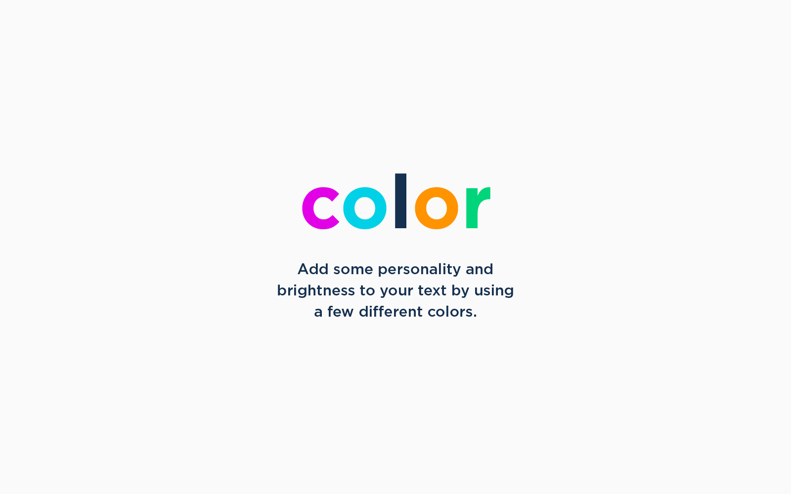
Making your text big and bold is a great way to help stop the scroll. You can easily add some color, brightness, and personality by using a few different colors in your text. To do this, highlight each letter and give them each its own color (you can repeat the colors if you need to). To keep things aligned with your brand, use your brand colors.
Drop Shadow
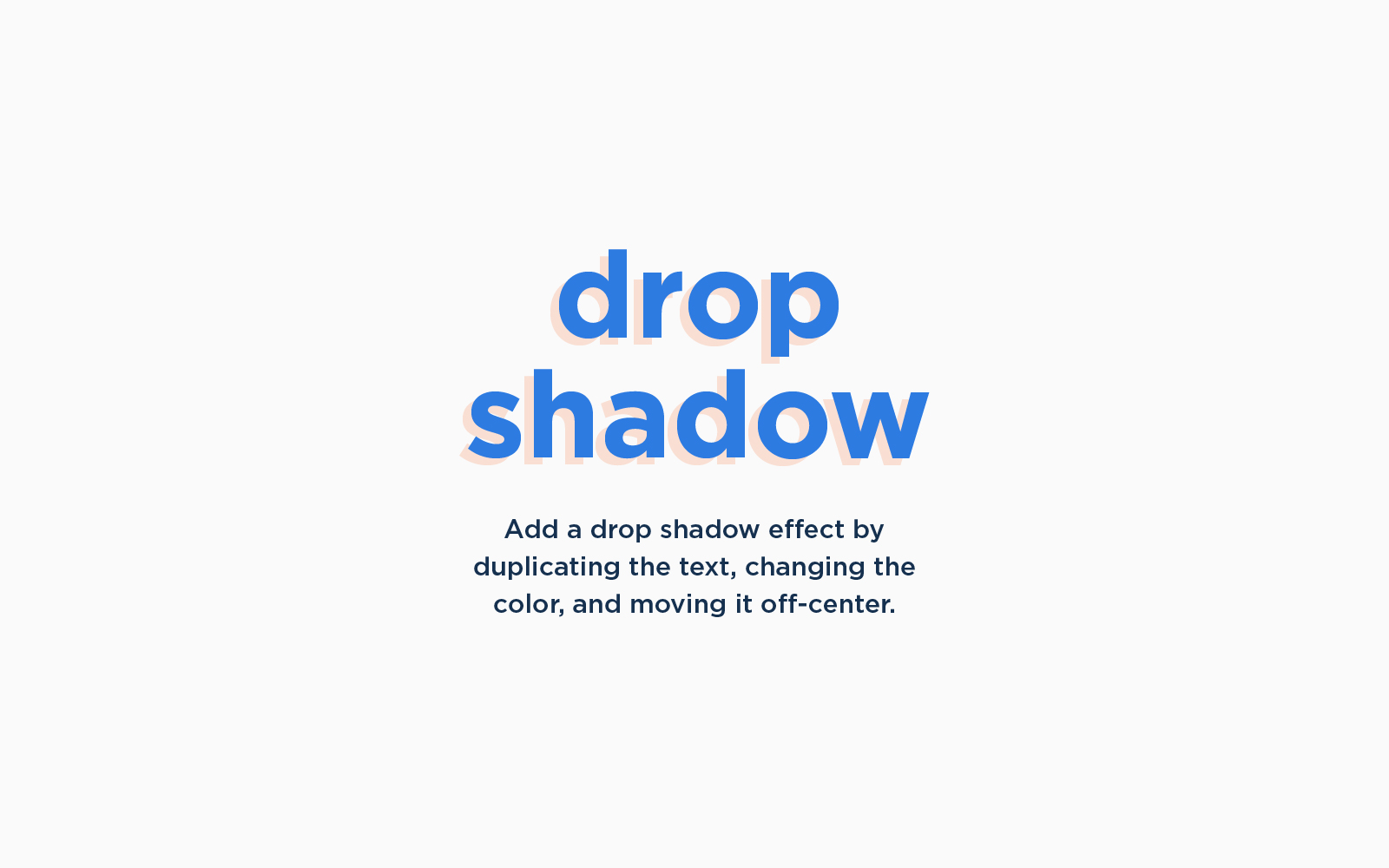
Don’t have access to a drop shadow effect? Get creative and make a drop shadow look by duplicating text (be sure to move it behind the main text), changing the color, and then moving it over a bit to the side and down so it’s a bit off-centered. To make the drop shadow more subtle, make sure you use a color that has just a slight contrast from the background.
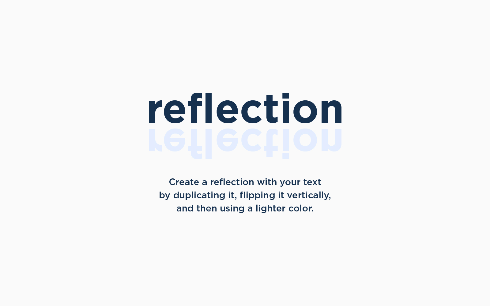
Reflection
A cool effect we don’t see very often is creating a reflection of your text. This is a great way to make things look a little “shiny” to your overall graphic. You can easily create a reflection of your text by duplicating the text, flipping it vertically, and then choosing a lighter color or a color that has only a slight contrast with the background color you’re using.
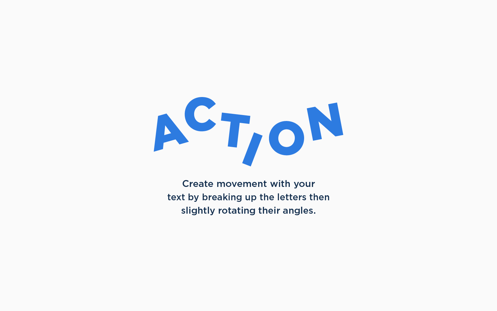
Movement
For something simple, but fun, you can create movement in your text by breaking it apart (or creating each letter individually) then slightly rotating each letter. This can be great for fun greetings or a word you want to emphasize. This effect helps your type feel exciting!
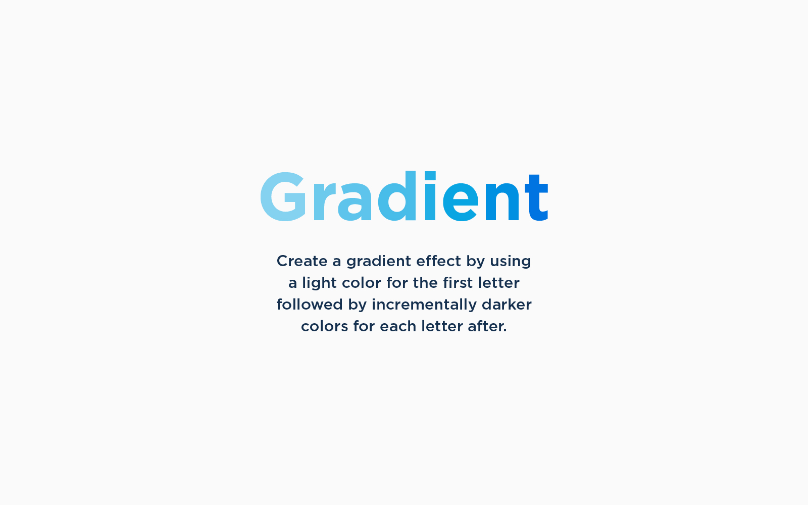
Gradient
We love gradients. And if you haven’t noticed, gradients are super trendy right now. Don’t have a way to create a gradient effect? Don’t sweat it. You can create a similar look to the gradient effect with your type by using a light color for the first letter and using slightly darker colors for the all the letters after.
Even if you might not have access to fancy design tools and resources, don’t let that stop you from getting creative to achieve the look you’re going for. Now that you have a few ways to start getting creative with your fonts and type treatment, go have fun and experiment!
“Creativity is inventing, experimenting, growing, taking risks, breaking rules, making mistakes, and having fun.” —Mary Lou Cook
We’ll be posting more ways to get creative with your branding so be sure to stay connected with us by signing up for our newsletter and following us on Instagram.
Until next time,
Happy Branding!
