
The joys of working on fun projects – especially when it's the trifecta: imagination, creativity, and fantastic collaboration!
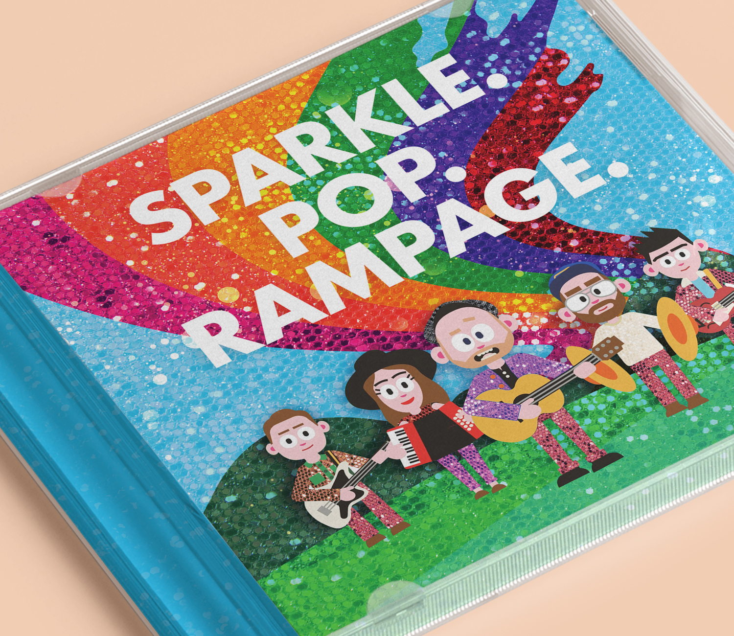
Today we want to feature a kid's album we helped bring to life called SPARKLE. POP. RAMPAGE. We created this kid-friendly album cover design, released by Rend Collective, an incredible worship band from Northern Ireland, for parents who were tired of listening to the typical kid songs on repeat (think "Baby Shark").
Let's face it, you can judge an album by its cover! Our mission for this project was to support the artists' vision and message while simultaneously capturing the exuberant imagination of tiny humans. And, since this was an album for little ones, our job was to create a visual language that was fun, bold, and enchanting without causing the grownups to lose their sanity and rethink all their life choices. Definitely a team effort, we pulled different, already created elements by other artists and packaged them up to work together in this record.
Our initial conversation for this project can be summed up in two words. Rainbows and Sequins. Those are the two must-haves from the band to bump the excitement up a notch.
Rainbows and Sequins
If the budget allowed, the first thing we would have tried to incorporate into the printing was foil. Unfortunately, we didn't have the luxury of using fancy shiny paper, so we opted to use stock images of sequins and use them as texture throughout the project. And, of course, nothing says it louder than having a fun rainbow on the cover of the album.
Characters created from the Sons of Graham

The Sons of Graham is an animation studio located in Bristol, responsible for creating these amazing videos that include the characters of each member of the band. To use these characters in the packaging (permission given, of course!), we recreated them in Illustrator and gave each a touch of sequins to match the concept and direction of the packaging as a whole. Illustrations by Natasha Debham from, My Lighthouse inspired the characters inside the packaging. To complement the style of the original characters of the band and images in the book, we recreated the characters (sequins and all!) to start creating one cohesive look for the packaging.
Creative typography

This project allowed us to have a lot of fun… it's a dream for any adult who is still a kid at heart! Instead of laying out the liner notes in a typical way, we decided to play with the type by allowing the words to "float" and "swim" along the waves of the water…really bringing it to life.
Additional characters needed

We needed to add a few more characters throughout the packaging, so we created supplemental illustrations similar to the rest, like the ones shown here! Creating these illustrations to match as a whole was really critical to make the experiences cohesive and seamless.
Hidden surprises (text on back and lion)

As you know, dynamic projects like these allow you to get creative and try new things! With the band's approval, we decided to create a secret word on the back of the packaging by highlighting one letter of each title. How fun!
The next hidden surprise is a lion (ice cream in hand) peeking through from one of the inside corners of the album. He's there, ready to greet you when you open the album.
From the very start, SPARKLE. POP. RAMPAGE. had been a fun collaboration! And our role of bringing the band's vision to life, creating supporting illustrations, and ensuring the elements we pulled into the packaging all looked cohesive, engaging, and fun was definitely one for the books!
We love bringing creativity into everything we do. If you have a vision of something fun, we want to bring that to life with you! Interested in collaborating with us? Send us a message with details, and we'll get back to you soon!
Want to see what else we've worked on? Click here.
